
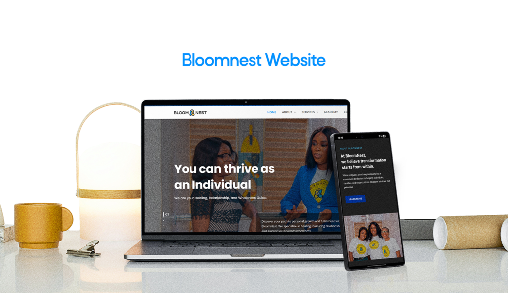



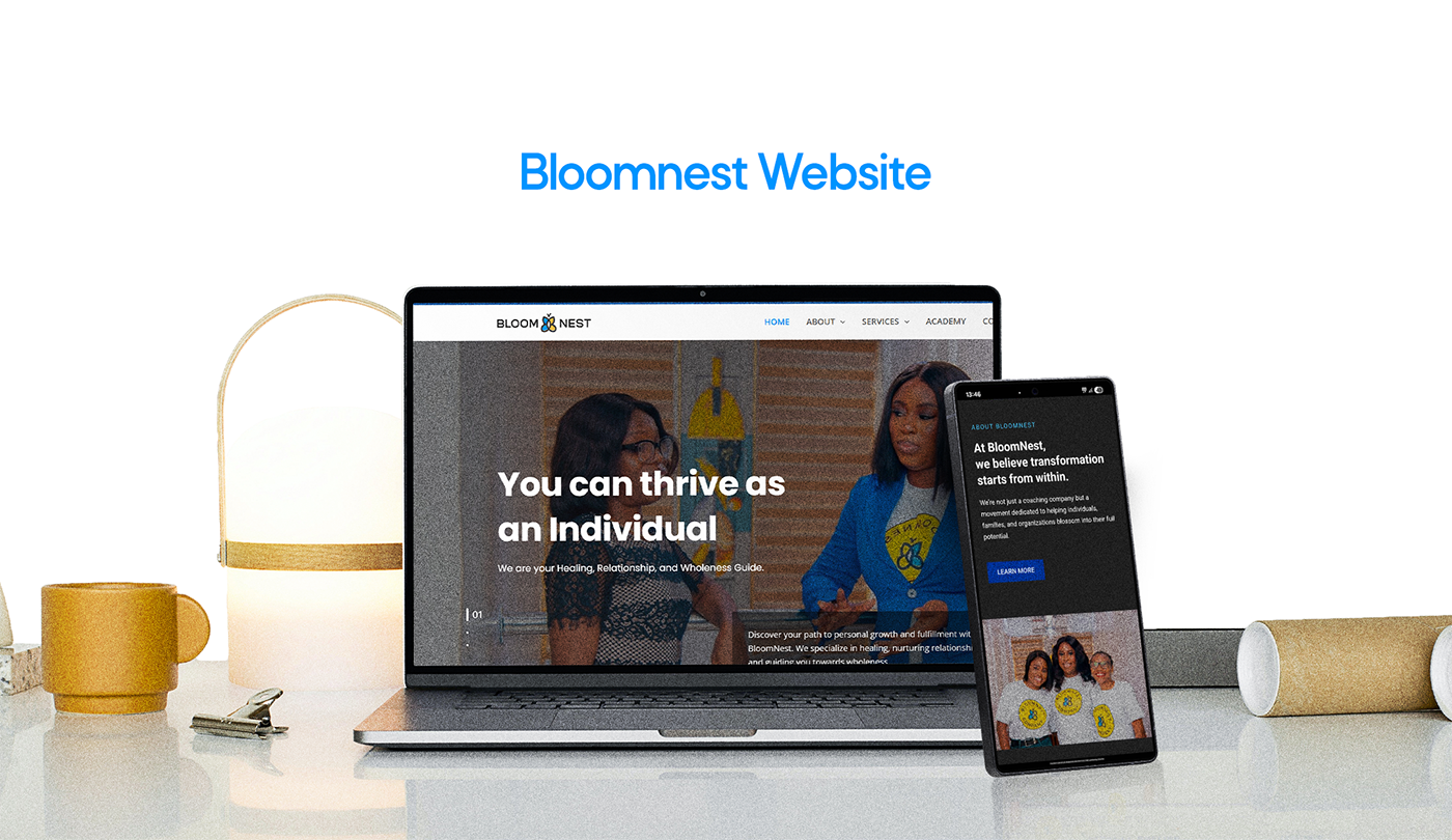


BloomNest came to us with a business that didn’t fit into one lane. It wasn’t just a coaching practice, or just a therapy service, or just an online academy — it was all three, serving four very different audiences (individuals, couples and families, corporates, and fellow professionals) under one brand. The challenge wasn’t building a website. It was building one that could hold that much range without feeling scattered or diluting the trust a relationship and trauma coaching brand depends on.
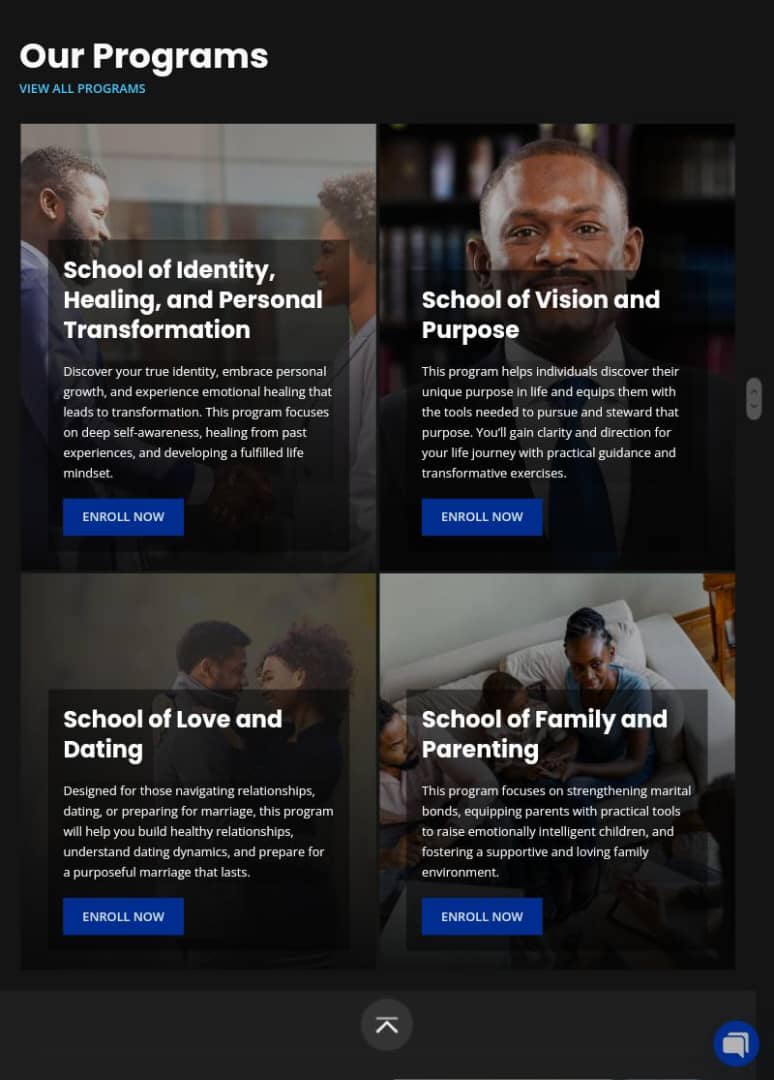
The core problem was navigation of intent, not just navigation of pages. Someone arriving because they’re preparing for marriage is in a completely different headspace than an HR lead exploring corporate wellness programs, or a counselor looking to get certified through the Academy. Send all three down the same generic path and each one feels like an afterthought. The site needed to recognize who was showing up and get them to the right service quickly, without making the other three audiences feel like they’d landed in the wrong place.
We worked through the site’s information architecture around that reality — structuring clear, separate entry points for Individuals, Families, Corporate, and Professionals, each with its own service breakdown (marriage counseling, premarital coaching, group classes, couples assessments, and more sit as their own paths under Family, for example), so a visitor never has to dig through content meant for someone else. Alongside that, we built out the supporting layer that makes a coaching brand feel credible online: a founder story that carries the weight of the work, testimonials placed where trust actually needs reinforcing, and a free emotional-capacity assessment tool designed to turn a curious visitor into a warm lead before they ever book a session.
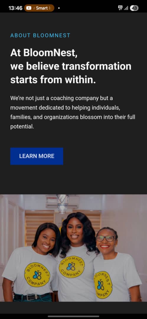
Just as much thought went into tone. This isn’t a brand that can lean on hard sales language — it had to feel personal, safe, and steady, since the people landing on it are often navigating real vulnerability. That meant restrained, warm visual pacing rather than aggressive conversion pushes, and copy hierarchy that leads with empathy before it leads with offers.
The result is a site that functions less like a single business page and more like four well-organized front doors into one trusted practice — where a couple, a corporate client, a single person, and a fellow coach can all land, immediately understand they’re in the right place, and move toward working with BloomNest without friction.